A Guide to Colorblind-Friendly Visualizations
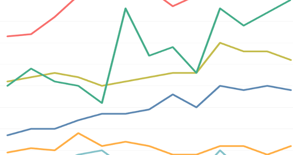
At the Institute for Advanced Analytics, we spend a lot of time honing our communication skills. This surprised me at first. Coming from a background in statistics, I had always spent more time thinking about the tests I was running or the models I was building than the presentation of Continue reading A Guide to Colorblind-Friendly Visualizations