
At the Institute for Advanced Analytics, we spend a lot of time honing our communication skills. This surprised me at first. Coming from a background in statistics, I had always spent more time thinking about the tests I was running or the models I was building than the presentation of my findings. But during my time at the Institute, I’ve learned an important lesson:
All your analytical work is wasted if your audience can’t understand your results. It’s essential to consider the needs of your audience and how you can help them follow along.
Data visualizations can make this process easier.
Color plays a critical role in visualizations; it can help demonstrate trends and emphasize differences. However, not everyone sees colors the same way. According to Colour Blind Awareness, approximately 300 million people worldwide are colorblind, including 8% of men and 0.5% of women. As data scientists, it’s our responsibility to ensure that we’re communicating in a way that’s inclusive as well as illuminating. The upcoming example will describe the common forms of color blindness and how we can use that knowledge to choose colors that work for everyone.
Figure 1 shows the median health expenditure as a percentage of GDP across different regions over time.
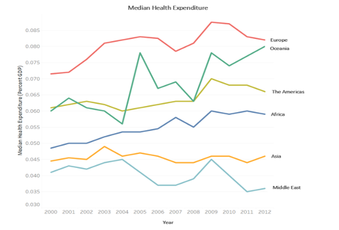
Figure 1: Original Visual
I created this visual in Tableau using one of the preset color palettes and example datasets. For most of the population, the colors in this visual (orange, red, and shades of green and blue) are easily distinguishable. However, these colors are not so clear to people who are colorblind.
The most common form of colorblindness is deuteranopia, or red-green colorblindness. People with deuteranopia tend to see shades of red and green as brown and, as a result, can find it difficult to distinguish between them. Figure 2 is the same line plot as in Figure 1, but with the colors adjusted to simulate how they appear to someone with deuteranopia.
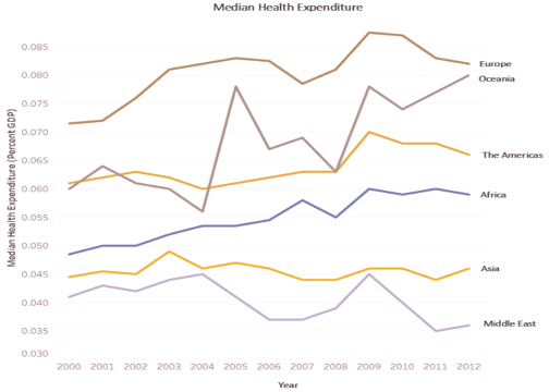
Figure 2: Original Visual (Deuteranopia)
Figure 2 is much more challenging to interpret.
- The initially light green line representing the Americas is now a very similar shade to the orange line representing Asia.
- The originally red and green lines showing Europe and Oceania are also quite alike.
Again, data scientists should strive to communicate results clearly and inclusively. There’s no reason to settle for a visualization that is difficult for many to understand.
A good rule of thumb for creating deuteranopia-friendly visualizations is to avoid using red and green in the same visual.
There is another rare form of colorblindness called tritanopia, or blue-yellow colorblindness. People with tritanopia often mistake blue and green as well as yellow and violet. While tritanopia is quite rare, it should still be considered when choosing colors for visualizations.
Ideally, avoid combining red with green, blue with green, and yellow with violet.
These rules may feel restricting at first, but there are many remaining color combinations that work well together.
For example, a common colorblind-friendly combination is blue and orange. Figure 3 is the same line plot as shown previously, but with an updated blue and orange palette.
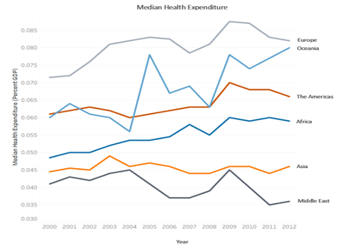
Figure 3: Updated Visual
The new colors are still visually appealing and easy to distinguish from one another. Let’s look at how this blue-orange plot appears to someone with deuteranopia (Figure 4) and tritanopia (Figure 5).
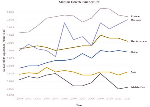
Figure 4: Updated Visual (Deuteranopia)
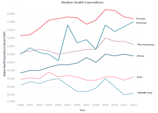
Figure 5: Updated Visual (Tritanopia)
Figures 4 and 5 simulate how the blue and orange version of the line plot appears to people with deuteranopia and tritanopia. These color choices can all be distinguished relatively easily.
These tips can help you choose colors that are accessible to a wider audience. However, there are other, rarer forms of colorblindness (such as monochromacy) that make it impossible to distinguish between colors at all. For this reason, use labels (as shown in the example plots) in your visualizations.
Choosing colors carefully is a great first step, but colors should ideally be used together with labels to ensure your visual is interpretable for everyone.
With these tips in mind (avoid combining red with green, blue with green, yellow with violet, and use labels), data scientists can create inclusive visualizations.
Here are some additional resources to help choose colors effectively.
- RColorBrewer: this R package imports many color palettes for use in visualizations. To see a list of the package’s colorblind-friendly options, use the command display.brewer.all(colorblind=TRUE)
- Tableau has a specifically colorblind-friendly palette and many diverging palettes, which can be an excellent option for visualizations. Diverging palettes feature two colors that are joined by a lighter color and grow darker towards the extremes. As long as the two hues are selected carefully, divergent palettes can be a good choice.
- Colorblindness simulators are extremely helpful for getting a feel for how a visual looks to people with various forms of colorblindness
Learning about how to communicate my analytical work effectively and inclusively has been one of the most important things I’ve learned so far during my time at the Institute.
I hope that these resources and tips are as useful for you as they have been for me and will help you create better visualizations in your coursework, your practicum project, and your career beyond.
Columnist Sarah Kate Schuhler