
Tableau is most often used as a visualization tool, but it is also a powerful tool to build exponential smoothing models for time series data. If your data uses an exponential smoothing model for forecasting (more recent observations are given greater weight), and you want to have a quick drag-n-drop prediction, this could be an efficient tool.
To use Tableau to build exponential smoothing models, the dataset must qualify for several prerequisites:
- At least one continuous Date
- At least one measure
- At least five data points
- At least two seasons (if seasonality is involved)
To demonstrate this function, I used the Covid-19 Daily Cases Data for the United States and North Carolina, which can be found on the CDC website. Choose “US and State Trends” in the links under the “Case Trends” tab, then choose “United States” in the “Select a State or Territory” dropdown. Click “Download Data” at the top of the Data Table underneath the visualization. Next, select North Carolina in the “Select a State” dropdown and download its data table.
Step 1. Connect data to Tableau
Open Tableau Desktop and connect the downloaded dataset to Tableau. You will probably want to use Excel to edit the datasets, so they only contain a single header line. Here, I also combined the data for the United States and North Carolina beforehand, so I only needed to connect to one dataset.
By default, the Date variable in the dataset is a string. Click the “Abc” on the data column and change the type to “Date.”

Step 2. Build a visualization
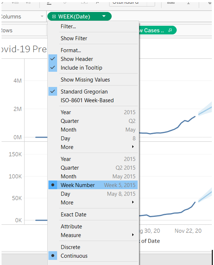
Go to Sheet 1, drag “Date” to the columns shelf, then drag “New Cases United States” and “New Cases North Carolina” to the rows shelf. By default, Date is a dimension in Tableau. Since we want to see weekly new cases, click the drop-down menu and select the continuous “Week Number” with the format of Week 5, 2015.
Step 3. Add forecasting to visualization
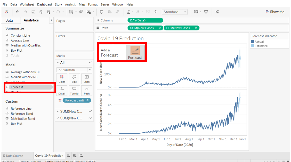
Choose the “Analytics Pane” in the left column and drag “Forecast” to the view. Hover over the Forecast icon in the “Add a Forecast” dialog and make sure you see it turn orange before you drop it into the view.
If you have multiple measures to compare (in this case, we want to compare US and NC Covid-19 cases), make sure you first select “All” on the marks card so both datasets will be predicted.
Step 4. Change forecast options (if applicable)
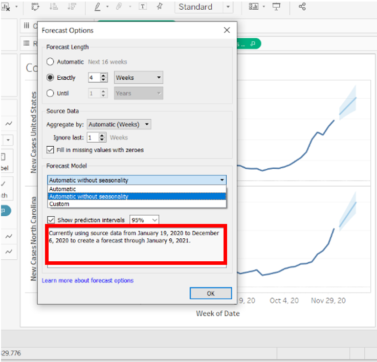
By default, Tableau will automatically choose the best model based on the data provided, but you can change the parameters in the “Forecast Options” dialog.
Right-click anywhere in the view, select “Forecast,” then “Forecast Options.”
In the “Forecast Option” menu, you can change forecast options as follows:
- Forecast Length: change the length you want to predict; in my case, I want to predict the new case numbers in the next four weeks.
- Forecast Model: I chose “Automatic without seasonality” since my data does not involve seasonality.
- Prediction Interval: you can choose a 90%, 95%, or 99% PI for the model.
Step 5. Change forecast result (optional)
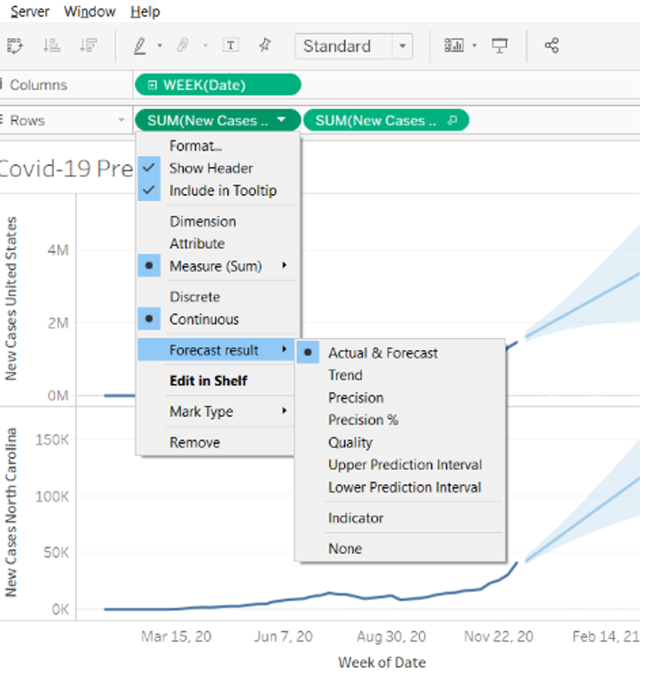
You can also change the forecast result based on your need. To do this, right-click on “New Case” pill in the Rows shelf and select Forecast result. Tableau provides a series of different forecast options, including the most common Actual & Forecast, Trend, Precision, Precision %, etc.
For our Covid-19 new cases prediction, I used the default “Actual & Forecast” option.
Step 6. Model diagnostic statistics
Finally, you can evaluate the model by looking at the metrics provided by Tableau.
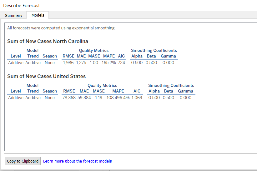
In the Analysis menu, click “Forecast” then “Describe Forecast.” In the Model tab, you can find all the diagnostic metrics used by Tableau.
Notice that in the dialogue box at the bottom of the “Options Used to Create Forecasts,” Tableau indicates that it uses the last week’s data as the hold-out sample, which will evaluate the model’s performance.
Clicking on the Model tab provides additional information. In my example, Tableau used an additive trend in the Exponential Smoothing Model without seasonality. The alpha, beta, and gamma smoothing coefficients represent the coefficients for level, trend, and seasonality, respectively. Since I did not include seasonality in my data, the gamma coefficient is 0. The greater a smoothing coefficient is to 1, the less smoothing is performed; thus, the estimates change more rapidly and rely more heavily on recent data. Notice that the model is automatically generated by Tableau based on the data I provided; thus, I cannot change the decomposition from “Additive” to “Multiplicative.” This could be one disadvantage if you want more flexibility for your model.
 Now you should be able to use Tableau to generate Exponential Smoothing Models for your time series data! While R and Python can provide you more control for your forecasting, Tableau can provide an easy drag-n-drop model with visualization at the same time! Have fun modeling!
Columnist: Luna Gu