Presentation Slides: Why you should use icons
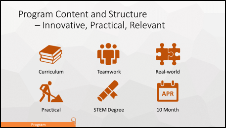
“An icon is worth a thousand of words.” Well, this statement may be a bit of an exaggeration. However, icons in presentation slides can communicate in a much better way than using words in terms of the quantity of information and richness of style. As analytics professionals, one important job Continue reading Presentation Slides: Why you should use icons

INFORMS

For three full days, five students immersed ourselves in analytics at the Informs Conference on Business Analytics and Operations Research (OR). We were given the opportunity to sit in on multiple talks covering a wide variety of topics while also networking with industry specialists. The conference, this year held in Orlando, Continue reading INFORMS

Blood Sugar Analysis App

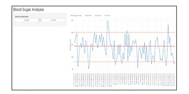
The ability for organizations to data mine and address a wide range of business problems across many industries is a huge asset in terms of ROI. What about big data and analytics helping not only the bottom line but also the general public? What about all the data that envelops Continue reading Blood Sugar Analysis App

Getting your hands dirty with Kaggle

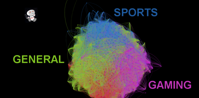
Image above is a visualization of Reddit I created using a public Kaggle data set found here, built with Gephi. One lesson I’ve learned over the past 7 months is that the best way to hone your skills within the field of analytics (or data science, or whatever term you wish to Continue reading Getting your hands dirty with Kaggle