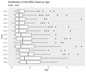
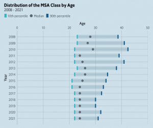
The ggplot2 library is an incredibly powerful and wonderful visualization tool for most graphs, but when it comes to boxplots, the ggeconodist library has the upper hand. Learning to use this library in R means you will no longer spend 10 minutes explaining your boxplot to your audience.

Both boxplots to the left present the same information: the distribution of the MSA class by age, starting from the Institute’s inception. However, as you can see, the boxplot on the top, which was created with the ggplot2 library, has many outliers that are shown as dots outside the boxplot. The presenter would have to take the time to explain those dots, the lines outside of the box, and the actual box itself. That would become very time consuming and likely bore the audience.

The second boxplot that I created with the ggeconodist library, however, is much easier to understand. The audience can quickly look at the boxplot and immediately see that the boxplot represents the tenth percentile, the median, and the ninetieth percentile. They don’t have to wonder what those strange dots dispersed throughout the graph mean. By looking at the boxplot, the audience can quickly see that the overall students’ ages in the MSA program tend to decrease over time.
I had never heard of this library until several months into my college internship when my boss asked me to try to recreate The Economist’s Mammoscam boxplot. It took many frustrating hours of scouring the entire internet to be able to recreate it, which is why I wanted to put a quick tutorial here and show how we can use it to graph some demographics about students in the Institute for Advanced Analytics.
Step 1: Install and load the ggeconodist library with the following code in R:
![]()
Step 2: For the ggeconodist library to work, you will then need to make sure you have the required fonts downloaded on your laptop. If you go here, click the green “Code” button and click “Download zip,” you can then download the required fonts to your computer that will enable you to use the ggeconodist library.
Step 3: Once you have completed step 2, go to your computer’s font book, and import the zip file you have just downloaded to your computer.
Step 4: Lastly, run the following code in R:

You should now be able to use the ggeconodist library in R! While the traditional boxplot is often hard and time-consuming for the non-technical audience to understand, the ggeconodist library enables you to make a beautiful boxplot that most any person can quickly comprehend and digest. So, now that you have been exposed to the ggeconodist library in R, I encourage you to experiment with the library and see its power for yourself!
Columnist: Ellie Casey
Data Column | Institute for Advanced Analytics
The Collaborative Blog for Students in the Master of Science in Analytics
