
On a hot Saturday morning, I lined up at the starting line to begin an 8-mile tempo that tested my fitness level. The road to the finish line was not smooth, but I victoriously crossed it at 50 minutes and 42 seconds, averaging 6:19/mile.
The time I achieved was only possible because I experienced runner’s high at a crucial time when I needed it—something I had never experienced before. According to Healthline, runner’s high is a state of joyful feeling that one gets during a run that can suddenly make a workout easy. This culminated in a life-changing moment that cemented a personal record in long distances.
Long-distance running has not been my greatest strength. However, for the 8-mile tempo, I felt good and prepared to take on the challenge. In the days leading up to the race, I fueled my body with the proper nutrients and consumed more water than the average human. Completing an 8-mile tempo was a challenge my teammate and I, both middle-distance runners, had never dealt with before. Additionally, it was a chance to prove to the coach that we were fit to compete in the next collegiate track race.
When race day arrived, I could hear my heart beating out of my chest and the nerves traveling through every inch of my body. With no time to compose myself, the gun went off, and the race began. I reached the first mile, looked down at my watch, and saw a time of 6:15, and my heart rate clocked at 143bpm. This was a good sign; I felt comfortable, and my form was the best that it could be. I used the first 3 miles of the race to control my breathing and focus on my running form to retain as much energy as possible.
The Strava output below displays the overall race statistics.
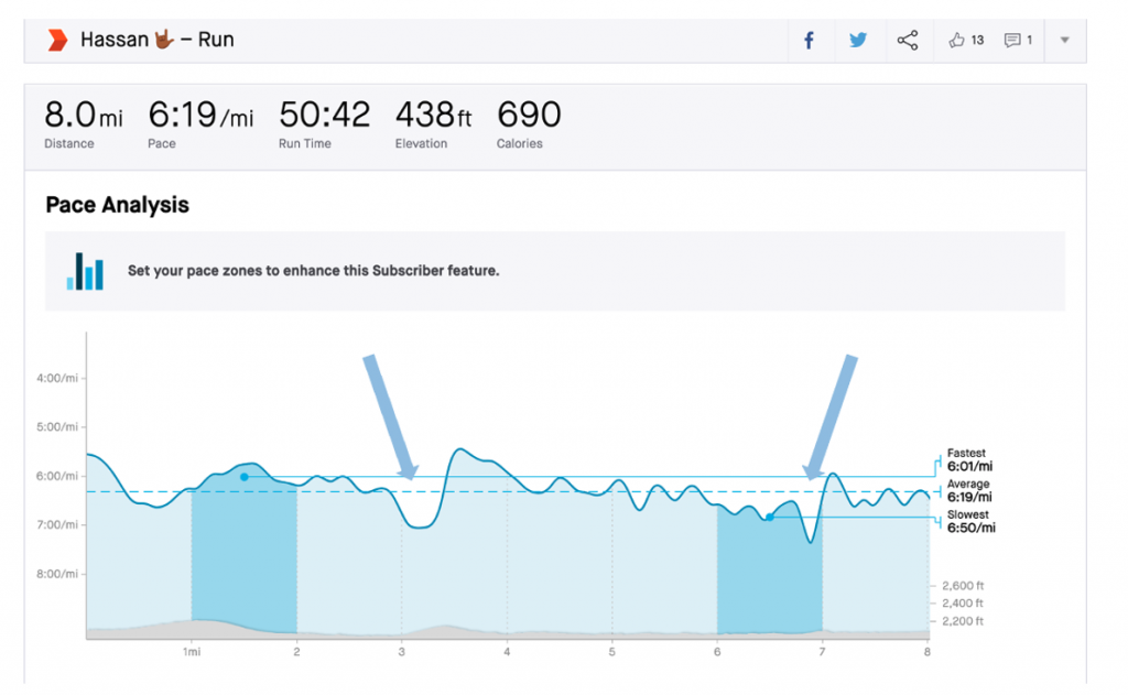
Figure 1 presents a trend graph of the race over time and my paces. The x-axis is the individual mile from 1 to 8, and the y-axis is the average pace per mile for each mile. The solid line on the graph is my fastest mile time at 6:01/mi, while the dotted blue line represents my overall average pace for 8 miles.
- The elevation in grey shows the hills.
- The light blue colored area on the graph represents my total pace zone.
- The dark, blue-colored area on the left is my fastest pace and on the right is my slowest pace during the race.
Rolling into the 4th mile, I found myself in a state of runner’s high. The fatigue I felt in the 3rd mile slowly faded as my heart rate began to stay constant at around 160bpm while still averaging 6:10/mile. From the graph (Figure 1, left arrow), there was a slight decrease in my pace after the third mile, then a quick recovery in speed to stay on track to finish at a fast time. The runner’s high faded as I ran up a hill in my 7th mile (Figure 1, right arrow); it was my slowest pace at 6:50/mile. For my 8th mile, I decreased my pace by 29 seconds to run a pace of 6:21/mile.
Student Athlete to Analytics Graduate Student
My career as a student-athlete had many success stories fueled by challenges that strengthened me. I have watched and played sports my whole life. However, my interest in analytics grew during my junior year of college. I was interested in ways to analyze my performance on the track. The drive to continue learning on and off the track led me to pursue a Master of Science in Analytics at the Institute for Advanced Analytics. The opportunities provided by the Institute have allowed me to grow professionally.
As a student at the Institute for Advanced Analytics, I have developed technical and analytical skills that have helped me improve as a data scientist. Therefore, I utilized my data scientist skills and downloaded all my runs recorded in Strava to perform an analysis to see what I could uncover.
My data had 811 observations from 2018-2020. My analysis examined the relationship between the distances I ran and the total running time. I filtered the data to only include runs greater than five miles. A scatterplot shown in Figure 2 represents the distance and the total time spent running.
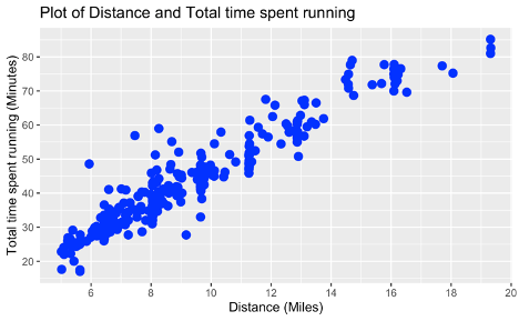
As displayed in Figure 2, the x-axis represents the distance in miles, and the y-axis represents the total time spent running in minutes. The scatter plot shows a positive linear relationship between distance and the total time spent running—the results from the analysis aligned with my intuition. As the distance increase, the total time spent running will also increase. It also helps me see my best times for each distance.
Applying the skills I have learned while at the Institute allowed me to understand my runs at an analytical level. Being a part of the Institute truly combined my passion for running with my analytical interests. As I continue to learn new topics as a data scientist, I also look forward to expanding my data analysis toolbox.
Running has had a positive and strong impact on my life, with runner’s high helping me achieve one of my best personal records in my sporting career. It is a feeling like no other, and a moment anyone can experience. So, keep doing what you love, and you will soon experience your runner’s high.
Columnist: Fuad Hassan