
At the beginning of Summer 2021, the COVID-19 pandemic looked to be behind us. Cases, hospitalizations, and deaths were at the lowest levels since the beginning of the pandemic, spurred by what appeared to be a combination of warm weather and increasing vaccinations. However, the emergence of the Delta Variant quickly upended this sense of normality.
While cases have risen everywhere, rates have been highest in the South/Southeast and lowest in the Northeast. This trend corresponds to the South/Southeast having the lowest vaccination rate of any region, while the Northeast has the highest. This seems intuitive: higher vaccination rate, lower case rate.
But what if it wasn’t so simple? Let’s remember that COVID-19 waves followed regional patterns before vaccines were in widespread use. The first wave of March 2020 hit the Northeast particularly hard, followed by a summer wave that primarily affected the South and Sunbelt. There is speculation about the effect of differing climates, with harsher weather keeping people indoors where COVID-19 spreads rampantly and mild weather driving people outdoors where spread is rare. However, for our purposes here, it doesn’t matter why COVID-19 waves follow regional patterns, just that they do. So, what is behind the current surge in cases in the South/Southeast? Is it due to regional patterns, low vaccination levels, or both? Based on my analysis, I will show that in the United States, vaccination rates matter, but region also plays a substantial role in determining case rates.
For this analysis, I will be looking at county-level data. Comparing vaccination levels and case rates by state gives incomplete information because vaccination levels vary considerably within states. In general, highly populated urban areas have much higher vaccination rates than sparsely populated rural areas. For example, in Wake County, NC, 71% of those eligible are fully vaccinated, compared to 26% in Stanly County, NC (a rural county outside of Charlotte). Therefore, one way to examine the relationship between vaccination rates and COVID-19 case rates while controlling for regional effects is to use multiple linear regression (MLR), with region and vaccination levels as predictors.
This analysis has two components:
1. Visualizing the link between vaccination levels and case rates by county within regions of the United States
2. Building MLR models to determine whether case rates are best predicted by region, vaccination levels, or both.
I found that counties with higher vaccination rates had lower case rates than counties with lower vaccination rates, even when controlling for region. However, region was a more powerful predictor of case rates, indicating that we may experience more seasonal waves of COVID-19 regardless of vaccination rates.
Methodology
Using data from the New York Times and CDC, I created a data set with the case rate per 100,000 and percent fully vaccinated for each county in the United States. I included only data from the current Delta Variant surge (July 6 – September 5, 2021), shown in the graph below.

The vaccination levels from July 6, 2021 were used, reflecting counties’ percentage going into the Delta surge. Each observation contains the total number of cases from July 6, 2021 to September 5, 2021, per 100,000 residents. The population data was imported from the U.S. Census Bureau to standardize case rates by 100,000 residents for each county.
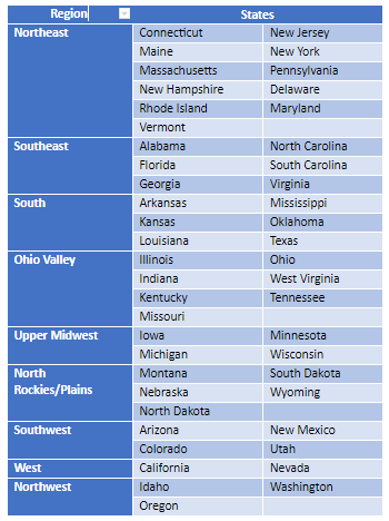
Due to the potential effect of climate, I used the climate-regions from the National Centers for Environmental Information to divide states into regions (Alaska and Hawaii are excluded due to their geographic separation from the Continental U.S.). The regions are defined as follows:
Lastly, I excluded counties in the following cases, which are nearly impossible and are likely a reflection of unreliable reporting:
- Vaccination levels of 0 or 100%
- Case rate of zero
These exclusions leave us with 2814 counties to work with out of the 3,006 counties in the U.S.
Visualizing the relationship between vaccinations and cases
First, let’s examine a scatterplot with vaccination levels on the x-axis and the case rates on the y-axis for the whole United States.

Each point represents a U.S. County. This graph shows that counties with higher vaccination rates tend to have lower case rates. The correlation, a measure of the strength of the linear relationship between these two variables, is -0.33.
Now let’s recreate the same graph, but only using counties in the Southeast.

In contrast to the scatterplot for the U.S., here, you actually see no relationship. Let’s compare this to the Northeast, where vaccination levels are highest.

In the Northeast, there is a significant negative relationship between vaccination levels and case rate, with a correlation of -0.28. Yet, these two graphs are less decisive than the graph of the whole country. Perhaps, region is playing an essential role in this relationship.
After running the correlations for each of the nine regions, there appears to be a general trend where counties with higher vaccination levels tend to have lower cases.
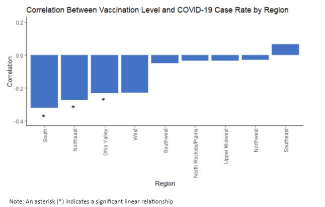
Three out of nine regions found a significant relationship, where higher vaccination levels correspond to lower case rates. The other six regions show no relationship at all. Furthermore, none of the relationships within regions are as strong as the overall U.S. relationship. This indicates that region may be a large factor in determining case rates of different counties. From the graph below, we can see large differences in case rates among the different regions.

We need to investigate further to find the relative impact of region and vaccination levels on the case rates.
Multiple Linear Regression Model
The next step was to use MLR to decide whether region or vaccination levels are stronger predictors of case rates. To do this, I built a model with one of the variables, then created a second model with both variables to see how much the prediction improves.
First, I examined the two models with either region or vaccination levels predicting the square root of case rates (a square root transformation better fit the data). Region is a categorical variable and was dummy coded into eight predictor variables, which inflated its R2 (variance explained) value. Therefore, I used adjusted R2, which penalizes the model for the number of predictor variables, to evaluate the models. The adjusted R2 was 0.44 for region and 0.12 for vaccination levels, indicating that region is a stronger predictor.
Next, I examined how the R2 changes for each model when we add the other variable. This change in R2 represents the additional variance in case rates explained by adding the other variable. When adding vaccination to a region-only model, there was a change in R2 of 0.0035 (0.35% additional explained variance). When adding region to a vaccination-only model, there was a change in R2 of 0.328 (32.8% additional explained variance).

We can see that the addition of region improves the explained variance much more than the addition of vaccination levels.
Takeaways
This analysis presents two clear findings:
- Counties with higher vaccinations had lower case rates, even when controlling for region
- Region was better than vaccination levels at predicting case rates
This has several important implications. First, increasing vaccinations may help reduce the spread of COVID-19. Vaccinations should be encouraged for this reason, in addition to their demonstrated effects of reducing severe disease, hospitalization, and death on an individual level.
Additionally, there may be under-looked regional effects that drive surges in COVID-19 cases, meaning that COVID-19 is unlikely to be eradicated due to increased vaccination. Instead, it could become endemic, continuing to have regional surges in the coming years.
We may need to begin to think of vaccinations as our ticket to living with COVID-19 rather than without it.
Columnist: Lev El-Askari
GitHub: https://github.com/lmelaska/COVID_Vaccinations_Region.git
References
Berube, Alan. COVID-19’s Third Wave Is Hammering the Midwest. Brookings, 11 Dec. 2020, www.brookings.edu/blog/the-avenue/2020/12/11/covid-19s-third-wave-is-hammering-the-midwest/.
Coronavirus in the U.S.: Latest Map and Case Count. The New York Times, 3 Mar. 2020, www.nytimes.com/interactive/2021/us/covid-cases.html.
Coronavirus World Map: Tracking the Global Outbreak. The New York Times, 28 Jan. 2020, www.nytimes.com/interactive/2021/world/covid-cases.html.
See How Vaccinations Are Going in Your County and State. The New York Times, 17 Dec. 2020, www.nytimes.com/interactive/2020/us/covid-19-vaccine-doses.html.
Enloe, Sanchez-Lugo. “U.S. Climate Regions.” National Climatic Data Center, www.ncdc.noaa.gov/monitoring-references/maps/us-climate-regions.php.
Data Sources
The New York Times (2021). Coronavirus (Covid-19) Data in the United States. Retrieved September 6, 2021, from https://github.com/nytimes/covid-19-data.
Centers for Disease Control and Prevention (2021). COVID-19 Vaccinations in the United States, County. Retrieved September 6, 2021 from https://www.cdc.gov/coronavirus/2019-ncov/vaccines/distributing/about-vaccine-data.html
USDA (2019). United States Counties. Retrieved September 6, 2021 from https://www.openintro.org/data/?data=county_complete