
Take an inside look at how often certain students participate in spring classes and who interacts in the same class. Names have been changed for privacy.
Key Findings
- The average student participated in class with 13 other students
- The 4 students who participated the most did not always participate together
Recommendations
- We recommend persuading future analytics students to start collecting data about class participation as soon as possible, preferably in the summer. With a larger data set over a longer period of time, there would be potential for much more interesting analysis:
- Compare participation rates over time
- Discover if more experienced students tend to taper off their participation more than less experienced students
- It may also be interesting to look at in-state versus out-of-state students and which group participates more on average.
Background
At the onset of the Spring semester, our class was beginning to mentally prepare for the job hunt season. But alas, even though 80% of the total material covered in the 10-month program was already taught, the remaining 20% was still left to be conquered and mastered (or at least quasi-ingested).
This allowed for an interesting opportunity. A thought occurred to one of these hopeful analytics professionals: which classmates participate the most during our lectures? With the precedent already set in the Summer and Fall terms, we had an idea of who these individuals might be. We collected the empirical evidence that would support or dispel these admitted preconceptions.
First, some ground rules had to be established:
- “Participation” was defined as “the act of voicing a query, answering a professor’s question, responding to a professor when called upon, or making a humorous comment during a lecture with the stipulation that the words uttered must be audible to the instructor” (source: Merriam-Webster Dictionary).
- Follow-up questions or comments were tallied as separate participation points. This was to acknowledge the engagement of the participator and reward the individual for his/her participation.
- The data collector missed some classes due to job search activities, so no information was obtained for these lectures.
- No data was collected for joint classes during which the Blue and Orange cohorts were merged. This is due to the difficulty of collecting data in a larger setting and because the environment changes could account for some differences in student behavior.
- Only one student collected data. Therefore, data for only one of the two cohorts was obtained.
Data Collection
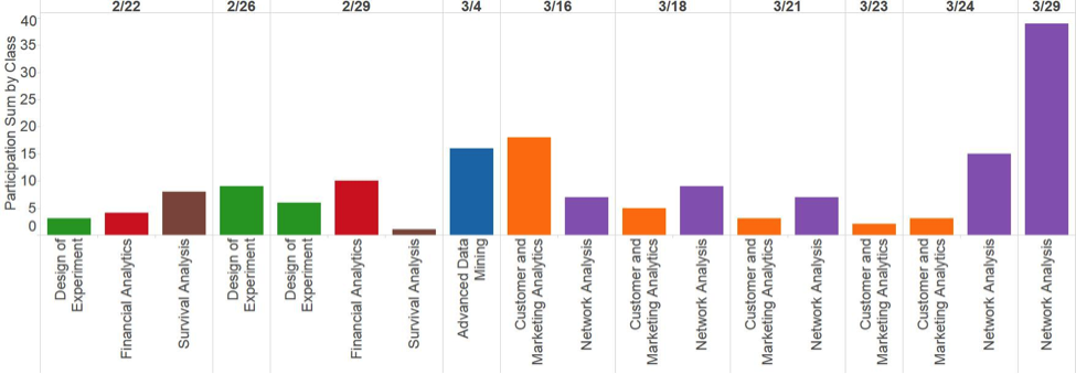
Participation data was collected on a per-student basis. Before February 22, the participation for each student was tallied as an aggregate. Beginning on that date, the data collection process was refined to specifically note how many times a student participated in each class on each date. The data for this report only includes those participation points obtained from February 22 to March 29. (Future cohorts are encouraged to take on this data collection approach and apply it for the entire 10-month program so to be better able to note changes over time.)
The number of lectures any two students both participated in was calculated for the purposes of this project. This figure served as the weights to the edges between the nodes (class participators). That is, if Kimberly and Glenda both participated during the Design of Experiment lecture on Pie Day (3/14), an edge was drawn between the nodes representing each of these students and an increment of 1 was made to the weight of that edge.
The participation data was augmented with two additional variables: practicum team and years of experience. “Years of experience” was defined as the time elapsed between undergraduate graduation and the start of the M.S. in Analytics program. This variable was then binned to account for the wide range of years of experience among the students.
Results
Network Visualizations
The initial network obtained is displayed in Figure 1 below. In this visualization and the others that follow, the size of each node represents the total count of participation for that student. That is, the bigger the node, the greater that student’s total participation scores from February 22 to March 29. The thickness of the edges (also held constant in these visualizations) represents the count of classes during which both students participated, with a thicker line representing a greater count.
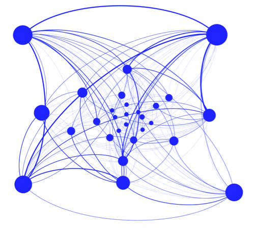
Figure 1 shows some expected as well as unexpected results. For example, as one might anticipate, the participation crossover between the four outer nodes (individuals who participated the most) is fairly high. Students who participated more often participated in many of the same classes. However, unexpectedly, the node in the bottom right did not have a strong overlap with either the node in the bottom left or the node in the top right. This means that although all of these students participated frequently, the bottom right student did not tend to participate during the same lectures as the other two.
Also of interest to our team of intrepid researchers was the relationship between and among participants in terms of Practicum teams. Figure 2 showcases this additional layer of information by color coding nodes and arranging them according to Practicum team.
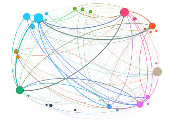
Among the interesting observations from this visualization is the fact that only one team had all five members participate at least once during the data collection window, and one other team had four of the five members join the classroom discussion at some point. 73% of the teams had either two or three members participate, and only one team had one participant.
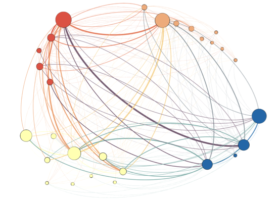
Lastly, the binned experience variable was added to the visualization. The color coding by Practicum team was replaced with color coding for experience (Figure 3). The light yellow dots on the bottom left represent all of the individuals who enrolled at The Institute directly after their undergraduate graduation. The light orange dots on the top right represent the individuals with 1-3 years of experience. The top left group in red signifies those students with 4-10 years of experience, and the blue nodes in the bottom right show those students with more than 10 years since the completion of their undergraduate degree.
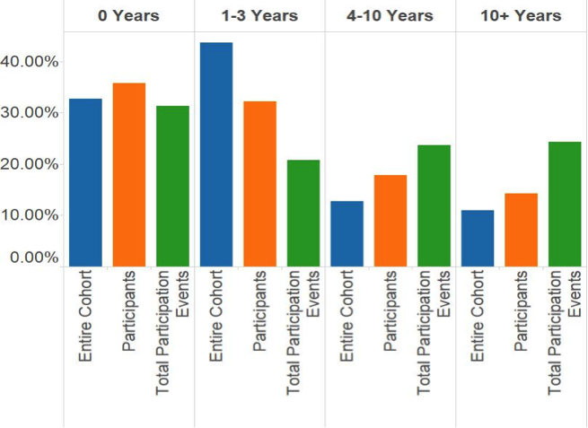
To provide context for this network visualization it is useful to understand the distribution of the experience bins in the cohort, including all students regardless of participation points. Figure 4 presents the information side-by-side with the distribution of experience by participators and by the sum of participation events. Generally, the counts of students were proportionally similar between the entire cohort and the individuals who participated at least once. The main exception was with the “1-3 Years” group, which had a difference of over 10%. The total participation events, however, was more erratic in that the percentages did not tend to line up with either the entire cohort or the participators’ distributions.
Descriptive Statistics
- We determined the graph density to be 0.505, which measures how interconnected the students participating in class are. Of the possible connections to each other, 50% actually exist in our network graph.
- The average clustering coefficient is 0.8 meaning of all the nodes and possible relationships between neighbors that could exist, 80% of the connections do.
- The average degree or connection to another student each student has is 13.64.
- When taking into account the weight, which is the number of times a student participates, the average weighted degree increases to 20.14 connections. This statistic puts more emphasis on connections between students that occur multiple times.
- The network has a diameter of 3. This means that the maximum distance between two students participating is 3, or the equivalent of having two other students to connect them.
- On average, the distance between any two pair of students is 1.5.
Fun Statistics
The single-day record for participation by an individual is 9, occurring on the March 29 Network Analysis class. In second place is a student with 8, and in third place is a student with 7. All three of these record-setting performances occurred in the same March 29 class. These three individuals account for 61% of the participation points for that day. The Network Analysis lecture on March 29 is also the session with the highest aggregate of participations for the class as a whole, more than doubling the sum of the next closest class.
There is also some evidence that more experienced students tend to have a higher participation rate. We ran a T-test to compare the higher two bins of experience (at least 5 years) with the lower two bins (fewer than 5 years). In order to make our data more approximately normal, we compared the average log of experience for this test. This yielded a P-value of .0458, so we concluded that we do have evidence that more experienced students participate more on average than their less experienced counterparts.
Columnists: David Wheaton, Caitlin Phelps, Nadav Lapidot