
Visual data exploration or how filters will change your life
Plotting your data is a necessary first step with any large data set driven project whether that is forecasting, predictive modeling or just providing summary statistical insights.
There are many ways to plot in as many software packages as you can imagine. I’ve enjoyed Tableau for a few reasons.
- For larger data sets being able to summarize millions of rows into an interactive picture is a plus
- Especially useful ability to connect directly to the SAS data sets
- Filters. I love filters to subcategorize your data. If you are used to SAS for exploring your data just think of Tableau filters as dynamic SAS “where” data step statements.
I use Tableau to connect to my data and then employ the filters to dynamically pinpoint missing and miss keyed values. The filters allow me to exclude these values from the visualization without altering the data set itself. Once I’ve found some interesting relationships I can select the most useful filter variables and their values as a guide to traditional SAS programming and SQL queries. Lastly I appreciate the ability to output the data used to create any visualization as well as see and export the full underlying data.
Showing is better than telling right? Up next an example of visualization built primarily for exploration. . .
Visualize Whirled Peas
Let’s say for the sake of argument you don’t have any finance or budgeting background. Let’s also pretend you’re given a data of all the General Government state budget line items for the past 13 years for North Carolina, ~ 3 million rows of transactional data.Finally, let’s pretend your team needs to present to representatives from the Office of State Budget Management. How are you going to understand the data you are given with very little domain knowledge well enough to present it to subject matter experts?
My answer is plot it and explore it with filters.
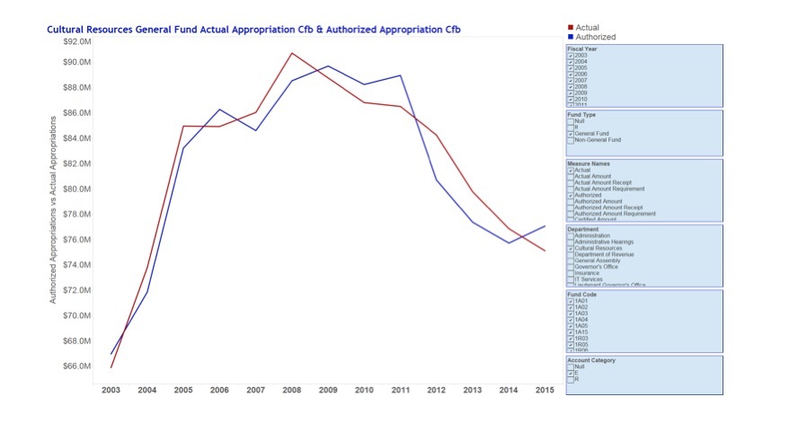
I experimented with different fields for both the X and Y initially while referring often to the data dictionary, but instead of writing queries in lines of code for new views it was easy to change the view with a drag and drop. In the above I needed actual spending in relation to authorized to see when departments went over or under budget. I used the filters to get to the correct actual and authorized fields as well as the correct fund and account category, but I only knew what to look for after inspecting many options and seeing all aspects of the data set. The hierarchy of filters let me select down to the individual account code.
The exploratory sheet I used is here. Feel free to play with it and create some of the views that just don’t make any sense.
Why was this point and click visual approach better than coding a number of visuals to see data relationships? To me It felt more like exploring an unfamiliar physical object. I found it easier to pull variables in turn and see them here rather than coding one variable or set of variables at a time in a static output.
Bottom line
The dynamic nature was faster for me insofar as the insights I could gleen.The exploratory sheet was the basis for a suite of dashboards created using the same filter based data exploration. The process was:
- explore a set of variables creating a view
- combine those views to answer questions and provide insight into the data
Ultimately we wanted to allow the state budget office to dynamically explore their data in ways they might not have thought of before.
There are a number of tips and techniques I learned along the way creating this suite of dashboards which I’ll summarize in a future post.
Important note: The OSBM data set report and presentation was a team effort and while much of the data exploration I discuss here was my own work it is due in no small part to hard work of the entire team. The above is posted here with their kind permission. Go Team Blue 3!
Columnist: R. Evan Miracle