
If you’re reading this post, you are likely a data scientist, a statistician, or someone who spoke with one and walked away scratching your head.
Whatever brought you here, I hope that after reading this post, you will leave with a better understanding of Q-Q plots.
What is a Q-Q plot anyway?
Simply put, it is a visual tool that statisticians use to help determine what distribution a data set may theoretically follow. For example, we often want to know if a data set follows a normal distribution. You may recall from statistics class that a normal distribution looks like a symmetric bell-shaped curve, where the majority of data is centered around the middle. Here is a picture if that doesn’t ring a bell!
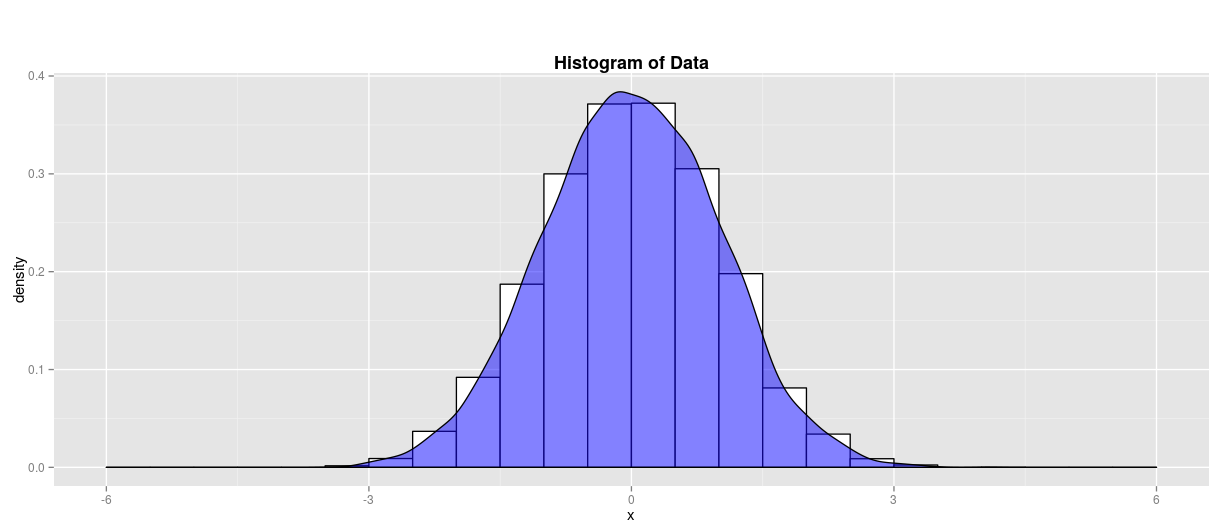
For data scientists, it’s often important to understand what type of distribution our data may follow before we start working with it, as different statistical tests are used depending on our distribution type. For this post, we will focus on using Q-Q plots to determine if our data follows a normal distribution like the one above.
How exactly do Q-Q plots help us understand the shape of our data?
If you haven’t figured it out yet, data scientists love to come up with a shorthand term for everything. A ‘Q-Q plot’ is just shorthand for a quantile-quantile plot. When we partition our data into equal parts, we call them quantiles.
For example, you are probably familiar with the idea of splitting something into four equal parts called quartiles. If we divide our data into five parts, each piece would contain 1/5th, or 20%, of our data and be called quintiles. This idea extends until we have separated our data to the point where each observation lies within its own quantile. Simply put, we can have as many quantiles as we have data points – although that might not tell us any helpful information.
When we make a Q-Q plot, we sort our data in ascending order, partition the data into quantiles, and then plot our observed quantiles against quantiles calculated from a theoretically perfect normal distribution. The number of quantiles from the theoretical normal distribution is selected to match the size of our sample data. Therefore, each observed point is matched to a point that comes from a theoretical normal distribution in the same quantile.
When we graph Q-Q plots, we typically put our observed value on the y-axis and our theoretical distribution value on the x-axis. So you can see that if our observed and theoretical points are the same, this will form a linear relationship! If both sets of quantiles came from the same normal distribution, we would see a line like this for our Q-Q plot:
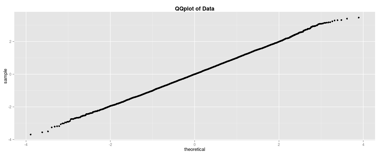
This line is actually created from the normal distribution shown at the beginning of the post and will be an essential baseline to keep in mind. However, it’s more common for our data not to match the normal distribution we expect. In this case, your Q-Q plot may look something like this:
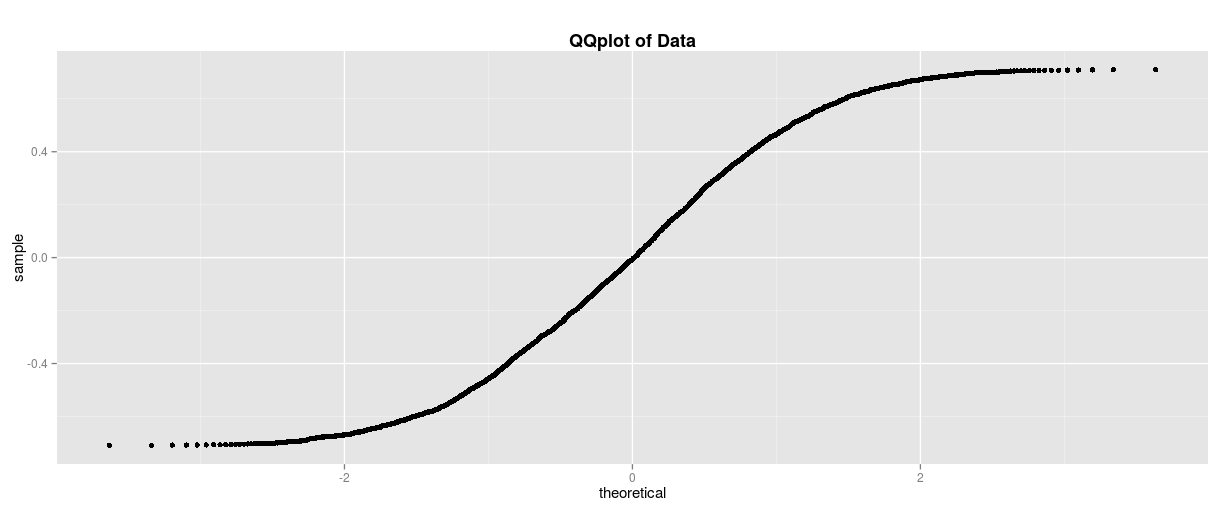
What is going on here? Our observed data has a smaller amount of data distributed in the tails, which causes the shape shown above. How can we intuitively interpret this picture without memorizing the shape? First, let’s take a look at the data that this plot came from:

Our data clearly has fewer values in the tails of the distribution than what we might see in a typical normal distribution. Now, let’s go back to that Q-Q plot and focus our attention on the area circled below.

On the left side of the Q-Q plot, the line curves up above what is expected from the theoretical distribution. This implies that the values on the left side are greater than what we have observed in the theoretical distribution. Now, a question arises for the reader: “Does this mean that the left tail should contain more or less data than a normal distribution?” It actually suggests that it should have less data, which can be confusing. However, recall that our normal distribution gets more negative the further left we go. This means that if we have greater values in our left tail, meaning values closer to 0 on our plot, then we actually have a lighter tail and fewer values on that side of the distribution. Hopefully, this makes sense, but if it doesn’t, you have another chance to practice this concept below.
Take a look at this Q-Q plot and imagine what the underlying data distribution looks like.
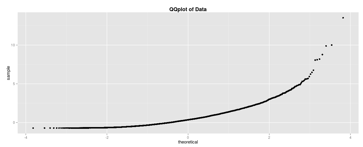
If you thought it looked something like this, then you’ve got the right idea! To break this down one last time, take a look at the right side of the Q-Q plot. You can see that the curve is pointing up. This means that our observed values were greater than our theoretical values, meaning there was more data in the right tail than there is in a typical normal distribution. That is why it corresponds to the right-skew distribution below, which has more data in its right tail!

Understanding Q-Q plots requires some practice, and even experienced statisticians sometimes fall victim to memorizing the shapes. However, with this knowledge, you should now have a better intuitive grasp of what data scientists are talking about when discussing data distributions using these graphical representations!
Columnist: Edward Baker