One of the data applications that has the most direct impact on people is healthcare analytics. The ability to shape how healthcare is delivered and to work with healthcare providers to help them do their jobs really appeals to me because of the proximity to people.
I wanted to get a sense of the data that healthcare analysts work with, but it’s really hard to get a hold of actual data, even if it’s deidentified. There are some very good reasons for this, not least of which is patient privacy, but it does make it difficult for aspiring healthcare analysts to gain experience with healthcare data. After combing Kaggle and government websites for health data and coming up empty-handed, I reached out to a friend in the healthcare data science space and asked his advice. With some sleuthing, he found a synthetic data set that had many of the same fields he deals with every day. With my data in hand, it was time to explore it.
How can this data generate value?
Healthcare analysts generate value by helping improve patient outcomes through process improvements. In the workplace, analysts work with healthcare professionals to develop metrics to measure the things they’re interested in improving. One real-world example was explained to me by a friend who helped a local hospital rethink how patients receive oncology treatment. If oncology patients spend a long time sitting at the clinic waiting for infusion medications to arrive, that might indicate 1) patient dissatisfaction, and 2) underutilization of the expensive resource of infusion stations. That amount of time wouldn’t necessarily be tracked, so nursing, analyst, and electronic medical records (EMR) staff could work together to code the time of each medication request and its fulfillment by the pharmacy. This collaboration between subject-matter experts (i.e. medical providers) and data scientists can lead to some really meaningful outcomes. In the example I detailed, it led to an increase of about 40% in utilization of infusion stations.
However, not all analysis requires such an intensive collaboration. Often, analysts have access to existing EMR, which contain an enormous wealth of information. It requires strategic thinking, however, to make use of that much information. In my case, the synthetic dataset was already provided so I had to ask “how can I use what I have to generate insights?” Since I had no patient satisfaction metrics or other follow-up data, I elected to use dates of admission and discharge to make a “length of stay” variable with “billing amount” serving as a proxy for healthcare professional hours spent on each patient.
My synthetic dataset also contained doctor, hospital, room number, blood type, gender, and age variables. I thought, perhaps, that the room number and doctor fields might provide some information on the medical team serving each patient. If I could suss out some differences there, it might help identify where to look for process improvements. Finally, I was ready to start using the data!
The analysis
Data: A new hope
To conduct a logistic regression to predict billing amount, I had to figure out a reasonable cutoff for “high” billing amount. When I looked at the distribution of billing amount, I was met with this:

That wasn’t exactly the distribution I was expecting. I decided to bin the billing amount into five bins of about $10,000 each and run an ordinal regression, instead of the logistic regression I had been expecting to do. Nonetheless, I was a few hours into my process and was excited to see how the model looked.
The data strikes back
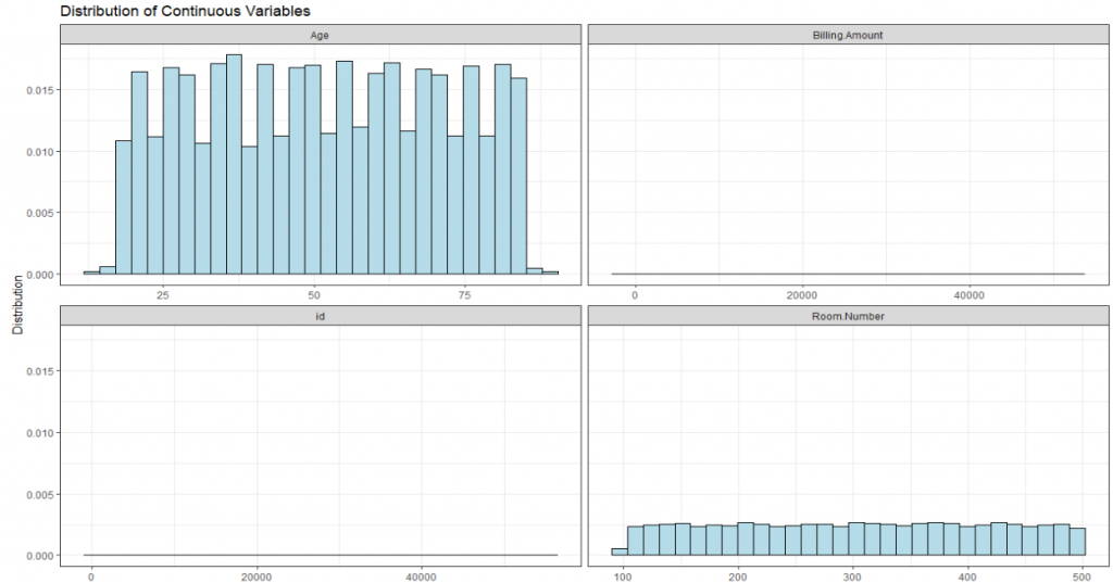
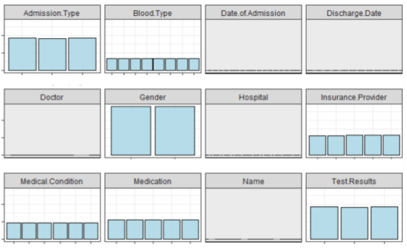
With 40,000 patients in my training data and a dozen or so variables, I expected the initial model to take less than a minute to build. After a few minutes without a model, I stopped R and checked my code. Everything seemed fine, so I took a second look at my data. If the billing amount was odd, maybe the other variables were too. Sure enough, for my 50,000 patients, there were 40,000 unique doctors and 40,000 unique hospitals. What’s more, the gender, age, blood type, room number, and every other categorical variable were uniformly distributed. Even if I removed the doctor and hospital fields, I wasn’t going to find any differences in my dataset because… there weren’t any. I felt so deflated; despite spending hours sourcing, thinking about, organizing, and cleaning my data, it was basically useless.


Figures 2 and 3 show the distribution of 16 key variables in the synthetic dataset. As you can see, the bars are all flat or very close to it. This means there aren’t sufficient differences between the groups for a meaningful analysis.
Return of the analyst
It was time for me to step back and reassess. Had my project been the grand slam for which I’d hoped? Absolutely not. It hadn’t yielded any interesting insights I could use for a report. However, it certainly hadn’t been a total loss. I gained some experience working with healthcare data and, though it wasn’t the type of experience I had been looking for, I had learned some useful lessons.
Primarily, I learned that it’s important to explore data before going too far down the road of even asking questions and thinking about analysis. Secondly, there’s always another project… I obtained data from Humana-Mays Healthcare that was provided for a competition. It contains 2 million observations with 300 variables of actual healthcare data. So, in a roundabout way, I did end up finding the dataset I was looking for. This time I’ll be sure to explore the data before I let myself get too excited about the analysis.
Columnist: Kevin Lloyd
